Project Overview
Famtask is a product I designed for an online User Experience design course from General Assembly. It is a family organization tool that's not just for the parents, it's for the whole family to use, and it syncs between mobile and desktop so you can have your family "whiteboard" with you wherever you go.
The Problem
If Mama ain't happy, ain't nobody happy.
There is an enormous amount of work involved in tracking and completing household to dos and too often the bulk of the organizational work falls to one person.
Busy families need a way to organize and communicate the family to dos in a way that lets everyone share the burden so no one needs to be "the keeper of the tasks."
The Solution
Famtask is a tool to help make getting tasks done more effectively and with less aggravation and stress. It allows families to track all of their to dos and projects in one place and allows parents to check the progress of children's tasks. And it syncs between phone and desktop so that you always have access to what needs to be done.
My Role
UX Researcher, Information Architect, Interaction Designer.
This was a solo project done under the guidance of a mentor.
Tools
Adobe Illustrator, Optimal Sort, InVision
Duration
5 weeks
User Research
Interviews
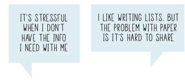
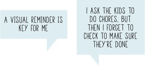
I interviewed 6 people, ages 35-50, with children living at home. I asked open ended questions about task management, communication, family roles and other topics to find out how people were handling family organization and what kind of problems and frustrations they were experiencing.
Analysis
To determine what the main frustrations and key goals were, I used an affinity map to distill the information I gathered from the interviews.
Calendar sharing was a problem for some families, most had devised a good working system, so I focused on family to dos. All of the families reported that they struggle with managing a shared family to do list. None of them were using a shared digital solution, even if the individuals in the family had personal digital to do lists.
Key Goals
- share the burden of to dos with the whole family
- improve communication between family members
- know when others have finished their to dos
- better manage long-term projects
- have one place to track all of family to dos
Main Frustrations
- communication between spouses is too one sided
- long-term projects get neglected and forgotten
- maintaining chore charts is difficult
- paper notes are hard to share and easy to lose
- easy to forget to check if chores have been finished
Persona
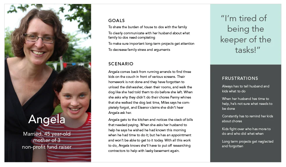
Using what I learned from the user research, I built a persona to help me stay focused on the user and the key issues while designing the product.
Competitive Research
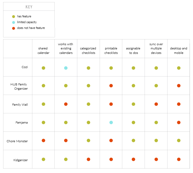
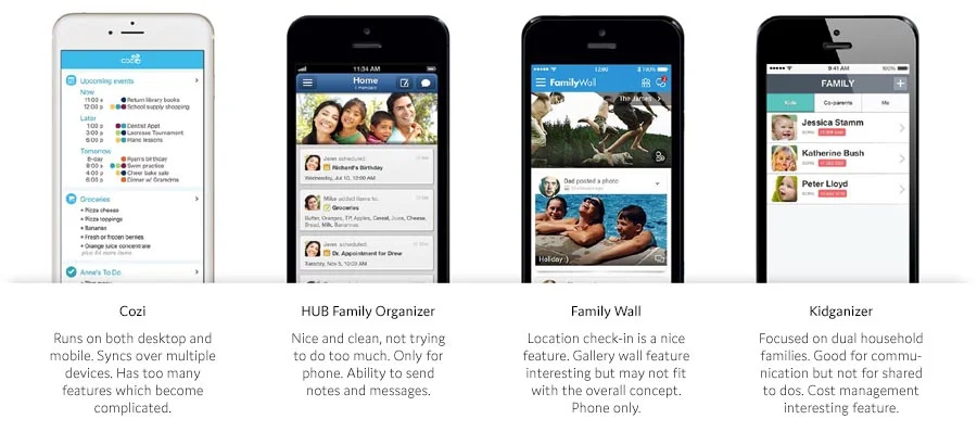
In order to get a solid idea of what products already exist and what they offer, I did some competitive research and analysis.
Competitor Analysis
Competitive Analysis Takeaways
From my research I concluded that there is space and need for a new family organization app. Cozi, the best known competitor, has many good features; but the people I interviewed wanted something uncomplicated and straightforward that the whole family can use. Cozi is trying to do so many different things that it feels overloaded.
Just one other competing app besides Cozi runs on both desktop and mobile, which is a key feature for my users to be able to achieve their goals. That app is limited to kids’ chore management and would not work for the larger goals of my users.
New Features
• separate personal and family space
• long-term project planning space
• the ability to add a task by voice on phone
Expected Features
- shared calendars
- printable checklists
- assignable to dos
Design
Features
Focusing on the goals of the users and research results, I used a matrix from low to high impact and expected to unexpected to prioritize features and determine which were important to keep and which could be cut.
Key Features
- Maintain shared family to do list and separate individual ones
- Assignable tasks with visual representation of assignment
- Syncable on both desktop and phone
- Ability to categorize and sort tasks
- Indicator when kids complete tasks
- Project area for long-term, multiple step projects
Finishing Touches
- Ability to add task by voice on phone
- Make it fun or rewarding to complete a task
Ideating
Problem Statement
Our user needs a way to organize and communicate the family to dos because it would decrease family stress and arguments.
How Might We
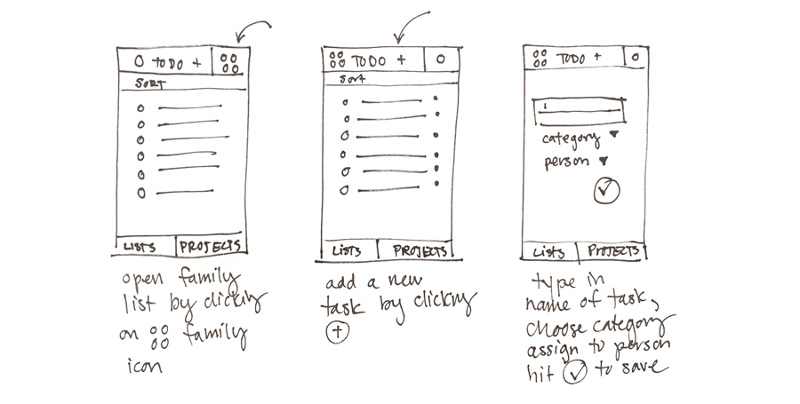
Keeping this problem statement in mind, I went through a How Might We exercise to think through potential ideas and solutions. I brainstormed, writing down and sketching out ideas for ways to solve the problem.
Storyboarding and User Flows
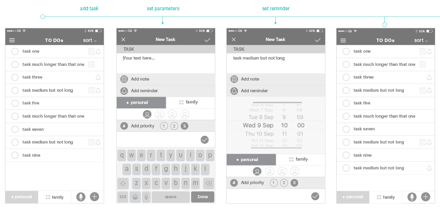
To start fleshing out the flow of the user journey and experience, I drew storyboards and then illustrated the path of interaction the user might have through the product to achieve his or her goals in user flows.
User Flow
Mobile First
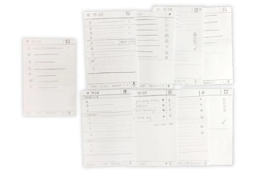
I started with the mobile app to figure out how the core functionality would work. I sketched many screenflows for the most important scenarios and then made them into paper prototypes. I did user testing with the prototypes to make sure the interface made sense and flowed well then reworked screens that presented pain points and retested.
Paper Prototype Testing Takeaways
The main functionality of the app seemed pretty clear to the test subjects and they were able to complete basic tasks. The testing clarified some areas that need improvement and consideration:
• Moving from personal to family view is confusing
• Need a way to cancel when adding a new item
• Consider adding the ability to have recurring tasks
• Look into having a recently completed view
• Consider not limiting the kid side as much - school project planning
Information Architecture
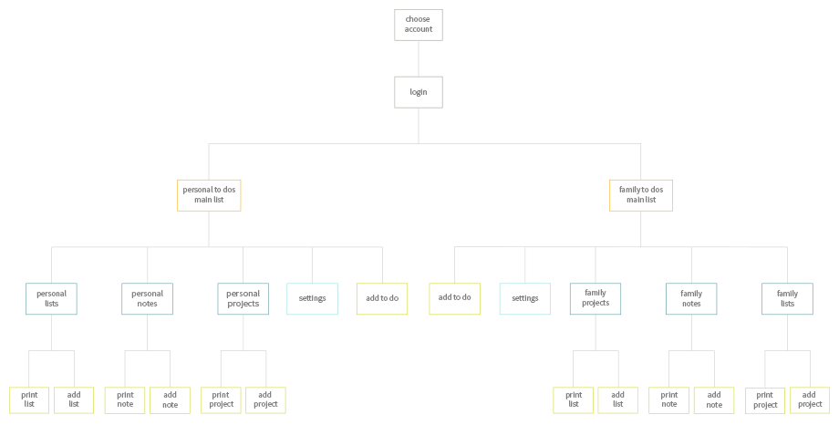
To help determine structure and organization, I did an open card sort of key site content. I used OptimalSort to find patterns in how people sorted the content and found that people mostly sorted by Family and Personal or by To Dos, Lists, Notes, and Projects.
I built a sitemap keeping in mind the need to navigate between the family and personal content, and to simultaneously have the content in those realms organized by To Dos, Lists, Notes and Projects.
Wireframes
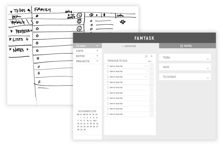
Once I had an idea of the flow and organization of the site, I started working on wireframes. I did many hand drawn, lo-fi wireframes to try various layouts and positioning, then added more detail and refinement, and eventually built an interactive prototype in InVision for both the desktop and phone.
Usability Testing
To make sure the designs were heading in the right direction and find out what needed changing, I conducted usability testing on both the iOS and desktop prototypes. I asked the participants to perform key tasks like:
- Navigating between the main sections of the app
- Adding a new task with certain parameters
- Switching from personal to family view
Interactive Prototypes
Testing Results
The testing went well for the most part; most users were able to easily complete the tasks given without guidance. There were also plenty of areas for improvement:
- Placement of printing and add item buttons
- Icon clarification
- Reduce task icons using hover states on desktop and swipe on iOS
- Differentiate the Family view from the Personal view
- Figure out how deleted tasks function and where they go
- Make the accomplishment of a task more rewarding
Next Steps
There are some next steps I would take if this were a project that was actually going to be built.
- Think about task lists in the Family section functioning differently than in the Personal section.
- Differentiate the family and personal “catch all” lists from the other lists.
- Make the completion of tasks rewarding, maybe even building in a competitive aspect for siblings with incentives for getting things done.
Summary
I think there’s a great opportunity for someone to create an organizational tool designed for families to share. As kids become more connected, they are starting to use their devices as tools as well as entertainment. And why stop at phones, tablets and desktops? I have a fridge that’s dying to have a family “whiteboard” integrated into the front!
What went well
Starting with the mobile app and then moving to the desktop app was useful because I had to really think about what the key functionality was on the phone and build a hierarchy around it. The interviews went really well and I was very happy with the amount of data I was able to generate.
Challenges
This was a online school project, so since I checked in with a mentor only once a week, I had to figure a lot of things out from the lectures, exercises, and doing my own research. I would have to get more feedback as I was working on new skills.
What I learned
This project helped me learn about the incredible value of testing early and testing often. In my past design experience, I would work on the visual design much earlier in the process and making changes were definitely more painful.

