Project Overview
Antengo is a free mobile app that allows users to post and browse location-based classifieds in real time. This class project for the General Assembly UX Design Immersion program was to examine what was working well and what could be improved with current experience, and to redesign the app.
The Problem
Antengo’s current search, browsing and security services are not meeting the needs of shoppers and sellers because of a cluttered and confusing layout, faulty searching functions and ineffective seller information.
The Solution
Redesign the app to give shoppers a more streamlined and enjoyable shopping experience, promote security, and increase item findability.
My Role
UX Researcher
Team
Christine Lew, Information Architect
Michelle Chung, Interaction Designer,
Jenny Pinzur, Visual Designer.
Duration
2 weeks
Tools
Google Forms (screener), Sketch, InVision
Research
Competitive Analysis
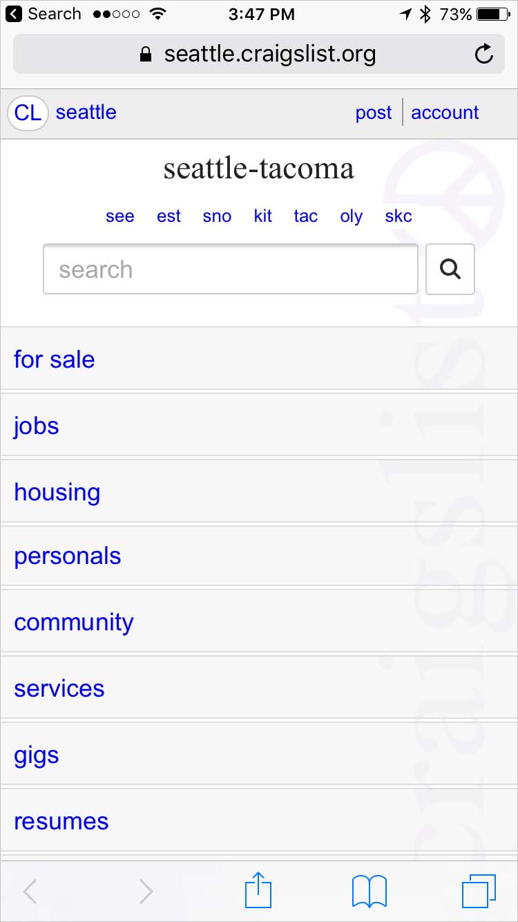
To familiarize ourselves with the market and get a sense of where Antengo fits we did a competitive analysis. We focused on 4 main competitors: Craig’s List, Ebay, Facebook Marketplace, and Offer Up. Christine did the research and I compiled the data.
Takeaways
The competition's transactions are done in person except for Ebay which focuses on online transactions. Atengo is doing both in person and online transactions. This would be a great competitive advantage, but in the current app, it's not clear to a buyer which items are shippable and not, which leads to confusion.
With the exception of Craig’s List, the competitors have user ratings and Antengo does not; so even though their tagline is “take the risk out of buying used”, the app feels less secure than the competitors because buyers have limitted information about sellers.
Usability testing
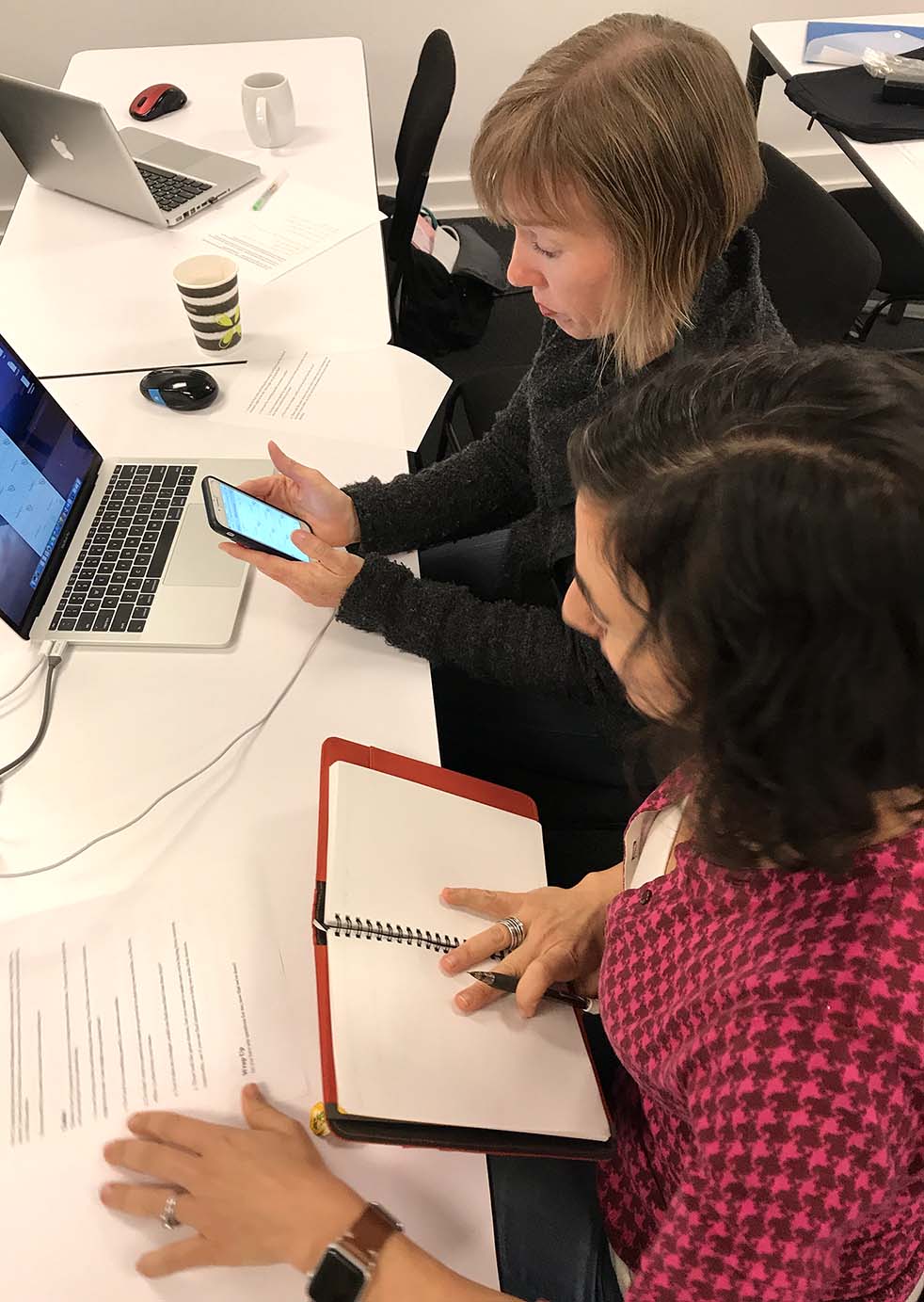
We started our investigation of Antengo with a usability test of the existing app. We tested with 4 users and asked them to perform the following tasks and give us their overall impression of the app:
- Find an item you would usually shop for secondhand
- Narrow your findings to items 10 miles from your home
- Think of another item and user the categories to help you browse for it
- Narrow your search by price
People struggled with the app and some of the consistent difficulties included:
- Icons and “sashes” were confusing and unclear
- Searching by location was not only hard to find and hard to use, it produced inaccurate results
- People had the sense that the site was “cheap” and “disorganized”
- Getting to the list of categories was awkward and unclear
Heuristic Evaluation
To gain more insight into the usability of the app, we decided to perform a heuristics evaluation. As a team we chose 5 areas of Nielsen's Usability Heuristics. Jenny performed the evaluation, and I synthesized the results. The study reinforced a lot of what we had found in the user testing, and also uncovered:
- Navigation is inconsistent and unclear
- Interactions and iconography does not match cultural conventions
- Sold items were appearing where they would not be expected
Interviews
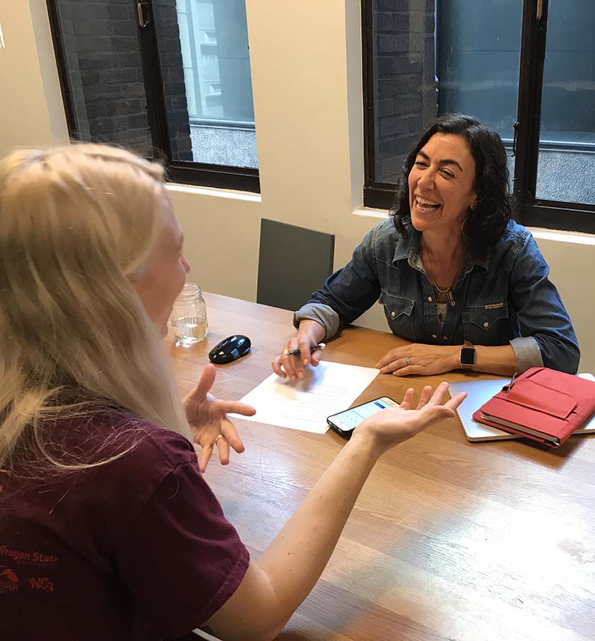
To gain more insight about shopping and selling secondhand, I recruited people with resale buying and selling experience using a screener I built in Google Forms. We interviewed 5 people using a list of questions as a guide. We wanted to get a sense of the experience of shopping and selling secondhand, why it's important to people and what their pain points and goals are.
Takeaways
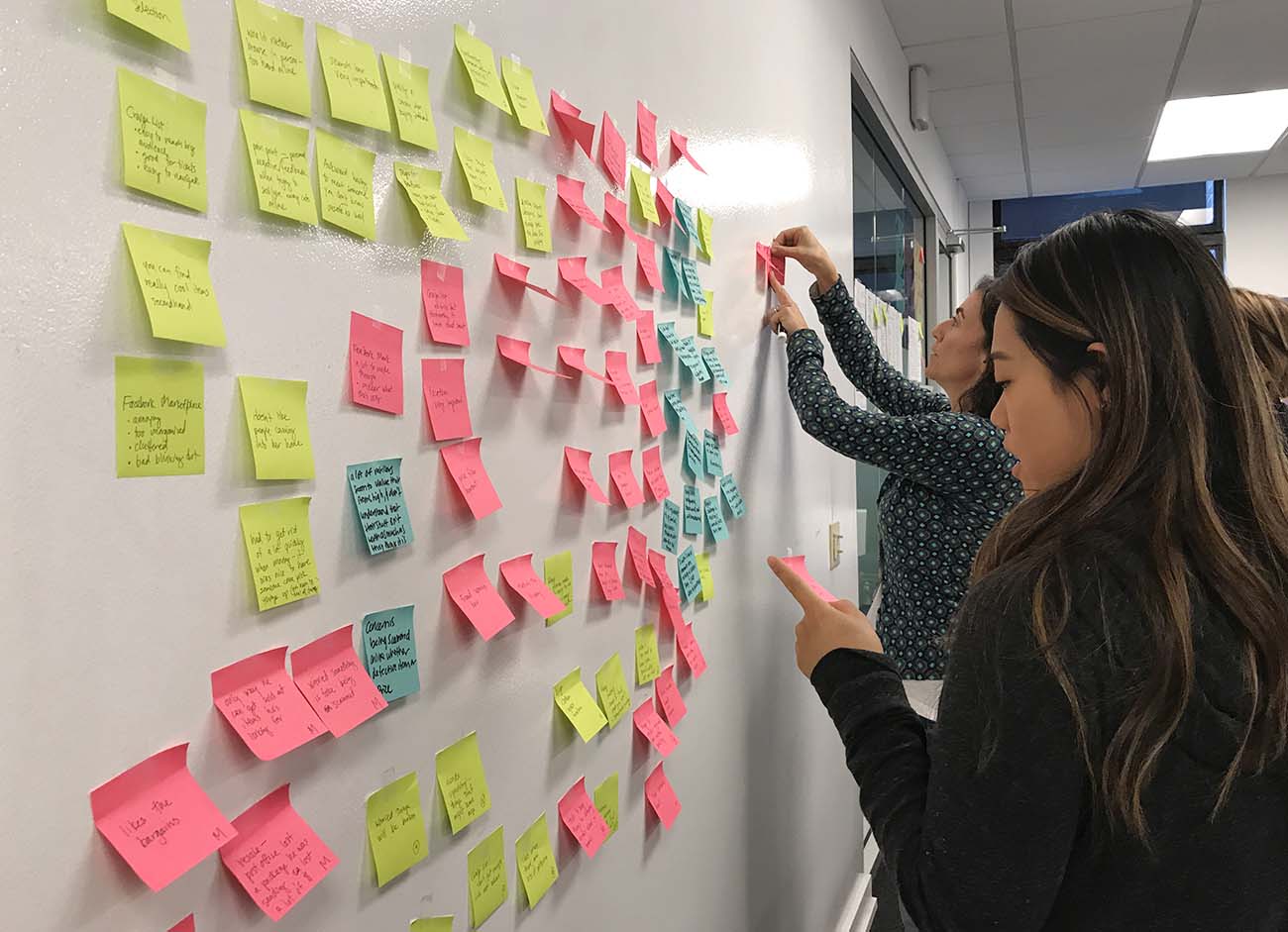
We used an affinity map to sift through the data and find themes. What we found is most important to shoppers and sellers is:
- Organization - people don’t want to shop with app or site that feels cluttered and disorganized
- Search - they want to find what they are looking for quickly and easily
- Browse - people also enjoy the ability to browse
- Security - both personal security and fraud protection are main concerns
- Communication - back and forth communication can be frustrating, people want easy ways to message
- Cost savings - a main motivator for shopping secondhand
- Treasure hunt - people love the excitement of finding “treasures” and good deals
Analysis
After analyzing the data from the user testing, the heuristic evaluation, the interviews and a competitive analysis, we decided the most important features of the app to focus our redesign efforts on were search and security. These were the features that were most important to the people we interviewed and not functioning well currently.
Search
For search we decided to work on the browse by category, filtering by price, and narrowing by location features. There were issues with how all of these were functioning on the current site and they were highly important to users.
Security
To address security concerns, we decided to implement a detailed seller page with a history of transactions. We also wanted to add a user ratings and a detailed user rating page with written reviews.
Personas
To help us keep this focus through the design process, I used the information from the research to build two personas (Jenny did the visual design, I created the content). Mary, our primary persona, was a profile based on searching goals and needs, our primary design focus. Kat, our secondary persona, helped us focus on security needs and issues. We used these often in the design process when thinking about priorities and features.
Design
User Scenarios
After building the personas, I worked on creating some scenarios that the Interaction Designer could use to help guide her wireframing process and that I could use to make tasks for usability testing. We wanted to make sure our changes to the app addressed the main goals and user pain points we identified in our research.
She and I worked closely together to make sure we would have all the right screens and screen states to test our scenarios:
- Mary is pregnant and is looking for baby furniture. She wants to just browse what’s available, so she uses the categories to browse.
- She also needs a stroller and wants to make sure she finds one under a certain price that’s close enough to pick up in person. She performs a search and then narrows using price and location filters.
- Because she wants to know she’s buying from someone trustworthy, she compares a couple of strollers.
Wireframes
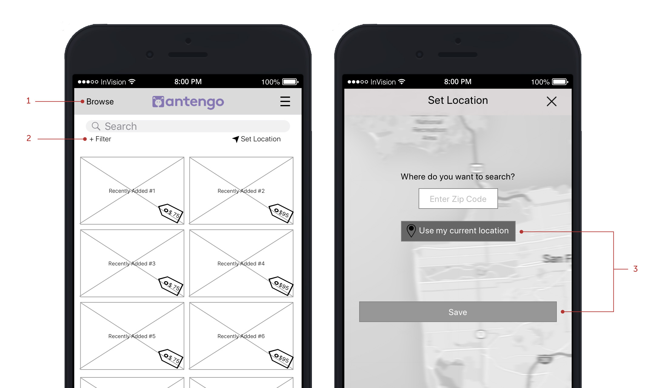
Michelle, the interaction designer, built wireframes that enabled a user to complete all the scenarios and then Christine built an interactive prototype in InVision so that we could test the designs with actual users and find out what was working well and what might need revisions.
Wireframes created by Michelle Chung
Usability Testing
Interactive Prototype Testing
I refined my scenarios into user tasks and conducted usability testing with 5 people, walking them through the following tasks.
Tasks
1. You are having a baby and feeling like nesting. You’d like to do a general search to see what kind of furniture is for sale - how might you go about that?
2. Now look for something specific, how about a stroller.
3. You don’t want to go too far to pick up your stroller, so find one within 15 miles from your house.
4. You’re also on a budget, could you find one that’s less than $150?
5. Those look like great choices, but you want to make sure you’re buying from someone trustworthy, see if you can find information to help you make that decision.
Testing Results
In general, our prototype testing went smoothly and people did not struggle to complete tasks. There were, however, some areas that needed improvement.
- Browse was difficult to find and not everyone was clear about what would happen after tapping on it
- Some items were too small: filter, drop down when choose “stroller”, price tag
- Set Location screen - participants hesitated after they put in their info and had to think a bit before hitting the correct button
- The link to the Seller's page from the product page functioned in a confusing way
Wireframes by Michelle Chung
Iterations
Michelle addressed the issues by:
- Renaming browse "browse by search" and moving it below the search bar
- Changing filter to an icon
- Reorganizing the Set Location page
- Broadening the link to the Seller's page
- Making some items larger
Visual Design
Jenny then created a style guide and high fidelity mock-ups.
Created by Jenny Pinzur
Next Steps
The next thing I would do is conduct another usability test to make sure that the changes we made function well and take care of the issues the test participants were having. After that, I would focus on the seller’s experience and start to research in more detail what kind of issues are most critical for sellers.
Summary
Challenges
It was difficult to balance the workload as some tasks for some people’s roles were dependent on deliverables from others; so there were times where members of the team did not feel like they had enough to do and times when they were really busy.
What went well
The team was all invested in the project and everyone worked hard in their roles. I felt like I could depend on all of my teammates. There were times when we had differences of opinion and were disagreeing about how to proceed, but we were able to work through them and come to solutions.
What I learned
The most important thing I learned on this project was the value of a design studio session. Seeing other people’s ideas and talking through the strengths and weaknesses of so many ideas was fantastic; and pooling our points of view helped us come up with a great solution quickly.

